One thing that made me very sad was that changing the title of my book to How The Cookie Crumbles meant I couldn't use the original cover I had created. I really loved that cover, mainly because the doughnut looked so yummy. Last night, I was looking at Joel Friedlander's site, he's a professional book designer, and once a month he judges all the book covers sent to him. There are winners, and there are not winners. Frankly, some of the covers are lousy, but I admire that the authors or designers were brave enough to submit, since I'm not. But reading Friedlander's comments is like a crash course in cover design. The main message I took is that covers need to look as professional as possible.
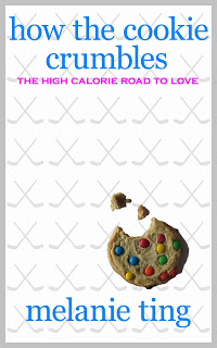
So armed with my new design knowledge, I took another look at my cover and sighed. The most amateur part is the photo. I took the photo of the cookie myself, and I have to admit–it looks a little green and unappetizing. It also floats weirdly on the page, since I didn't add a shadow. While I'm sure I could fix that in Photoshop, I'm also sure it would take me ten hours to figure out how, given my learning curve in creating the covers. So, I headed over to my favourite free stock photo site, Stock.xchng, and managed to find a better cookie photo. It has colours similar to the doughnut I loved.
So, here's the original doughnut cover. Nice, eh? Well, I think so. Expert opinions may differ. It's probably the photo that makes it, since everyone loves doughnuts.
And here's the cover I did with my own cookie photo. After publishing my first book, I added the grey border because otherwise the cover disappears on the Amazon website, and I also made the hockey sticks a little more visible. I preferred the subtler sticks, but they completely vanished when I looked at them on an actual Kindle.
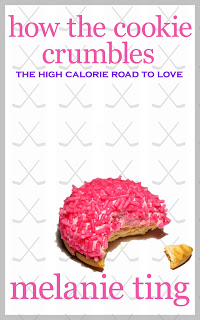
Now, here's the new cover. I added the new photograph, and put the font in the same colour as the cookie. I thought it looked way better, but the combined colours were a little too Barbie.
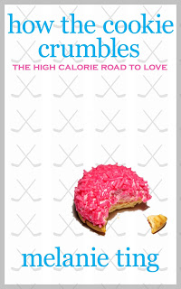
So, I tweaked the cover: shrinking the cookie (and thus its calories) and making the font colours closer to the original doughnut cover, but keeping the new "cookie pink" colour in the subtitle. Voilá!
Another thing I like about my cover design is that it's a template, so I can easily create covers for all my zillions of books, by choosing a new photograph. Now I just have to write zillions of books.
Now, what do I think Joel Friedlander would say about my cover? Probably that I need to look at book covers in my genre, and make it look more like them. So, if it's a romance book about hockey, it needs a ripped male torso and skates, or two people making out. But I would argue that my books are not typical romances, they are Frankenstein hybrids of chick lit/romantic comedy/hockey story–and therefore the covers should look fun and different. And then Joel would shake his head and say, "Mel, I give you expert advice worth thousands of dollars and you insist you know better. You're an idiot."
What do you think of the cover? I have to admit, I have a background in arts and design (but not Photoshop!) so I have pretty strong views, but I am willing to listen to the opinions of people who actually read my books. Oh, at first there'll probably be crying and ripping of t-shirts, but then I will take your criticism into consideration. Maybe.


