I seem to have been editing and re-editing
my latest book for a lifetime. But in keeping with the tech idea that she who
ships, wins—I’m going to stop striving for perfection and just get the book
done. After all, it’s a trilogy, and I thought that the first book would be the
easiest. But judging from my process so far, they’re all going to be hard, and
the third one will be brutal.
But, I am getting stuff done. Today, I did
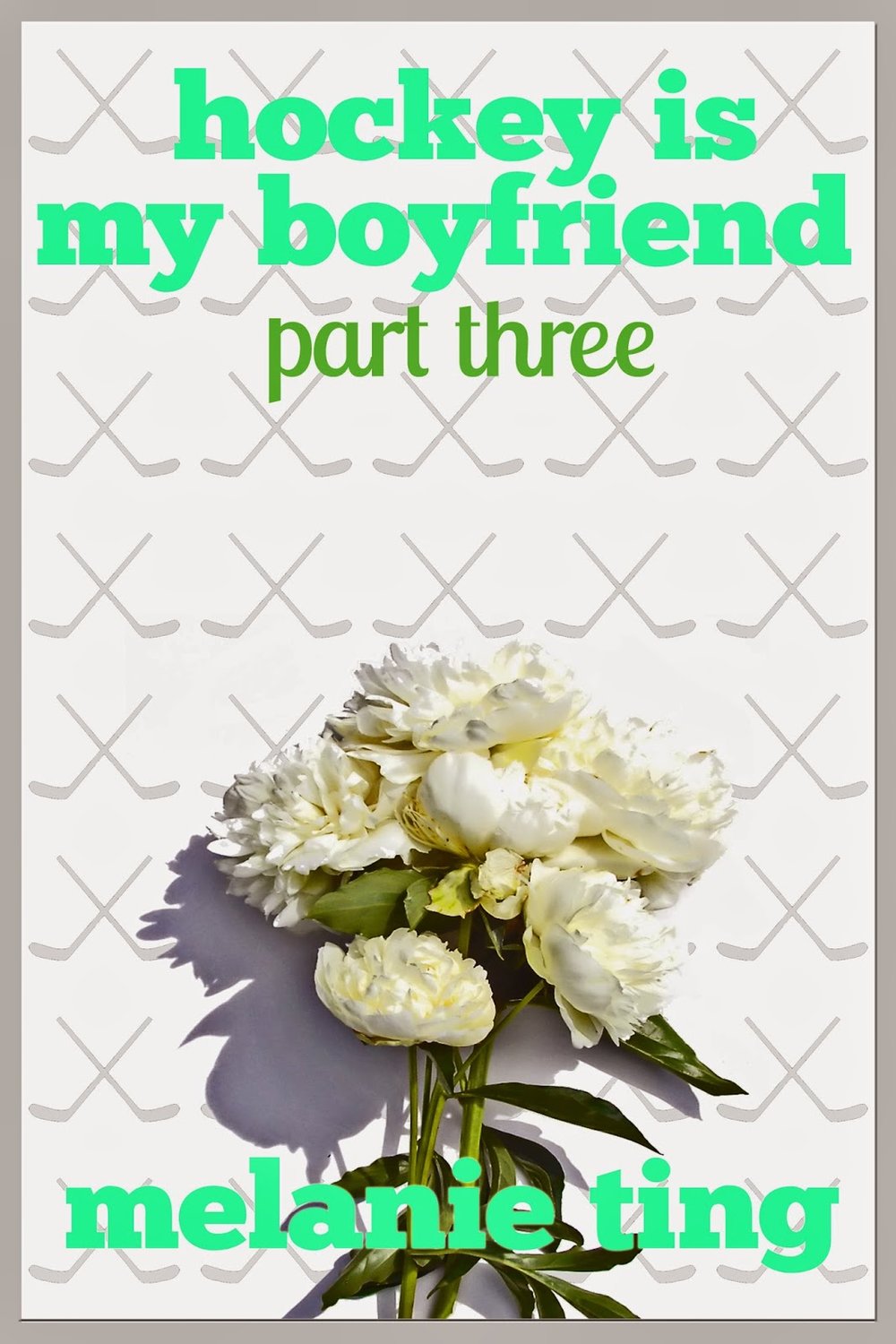
the covers. If you couldn’t tell already, I do all my own covers. Yeah, I knew
you could tell. But my zero-cost cover budgets work for me. I never have to
stress out about sales, because one sale and I’m already making money. As long
as you don’t count all the hours I spend on my books. Then I’m probably making
less than the babysitter of a sweatshop worker.
At
first, I did my covers to Kindle specifications, but then I noticed that my
covers were all long and thin. As much as it may be my dream to be tall and
thin, I think shorter, fatter book covers look better. Oh sorry, that should be
height-challenged covers with a healthy BMI. Anyway, I changed the size this time out.
I am very interested in what makes good
cover art. In my post on self-publishing, I think I mentioned this monthly e-book cover awards contest. While I would never have the guts to enter my
covers in the contest, I learn a ton by reading the comments and using my
own judgement.
One area I identified as a weakness was my
fonts. I have a big ole crush on Georgia, and I use it all the time when I
blog. So when it came time to for a title fonts, I turned to Georgia. It looks
contemporary and fresh to me. But I've since learnt that you should not use
any of the normal fonts on your computer for book titles. So, I searched around
for a font I liked (free of course, since you know my zero budget) and I found
a couple of great ones on FontSquirrel. The main title is in a sans serif that
looks contemporary and it’s a lot fatter—I mean healthy-weighted—than Georgia,
so more legible to readers when in a tiny thumbnail. Then for the subtitle, I
chose a font that’s fun and light, which is what my books are. The font's name is Lobster! I love that.
For this project, I had to make three
covers at once, so I needed a common theme for the visuals. I decided on
flowers, for a few reasons. First off, I’ve seen some really nice flower book
covers lately; they look intriguing and compelling to me. Secondly, flowers
figure into my trilogy. My heroine, Kelly Tanaka, has a father who is a florist, she gets flowers at
various points from various suitors, and someone even compares her to a flower.
(Unless I edit that part out in my relentless process.) And thirdly, I love
colour and flowers are tops in that department.
So, I started searching for flower images.
I had a few ideas in mind, but what is available in my price range and what my
imagination wants never match up. Eventually I found a few suitable images and
starting applying my Photoshop skills to make them useable for my cover design.
I like to maintain a look for my books, and that includes a hockey stick
background, colourful titles, and an image suitable to the book. Again, the
main intention is communication. I view my books as a little romance, a little
chick lit, and a little hockey. Hopefully, that is what the covers communicate. Also, I wanted to point out that my cover backgrounds are white, but when I put them on Blogger, they turn grey. Not fifty shades, though.
I experimented a lot with the covers. One great thing is that I can fool around with title names, since I'm the writer and the cover designer. I determined that a shorter title looked better with this font, so I tried some alternate titles and settled on this one. Photoshop
is an unending source of frustration for me, but I’m improving all the
time. I had someone helping me for a while, but he got fed up and pointed out
that he was Googling the answers to all my dumb questions. So that’s what I do
now. And I feel like I’m gaining a useful skill. (Photoshop, not Googling.) The real test will be when I can
do something like Lift Cat.
Anyway I ended up with four covers. The first three are the ones I picked and the alternate one is the cake. You can decide if you like the
alternate better. Or you can tell me that I’m an idiot and my covers looked
better before. But I don’t think so, if I were judging the e-book cover contest,
I’d choose me. I may be a little biased though. And I do realize that I'm supposed to tease and reveal my covers when the books are launching, but I was so excited, I wanted to share them right away!


